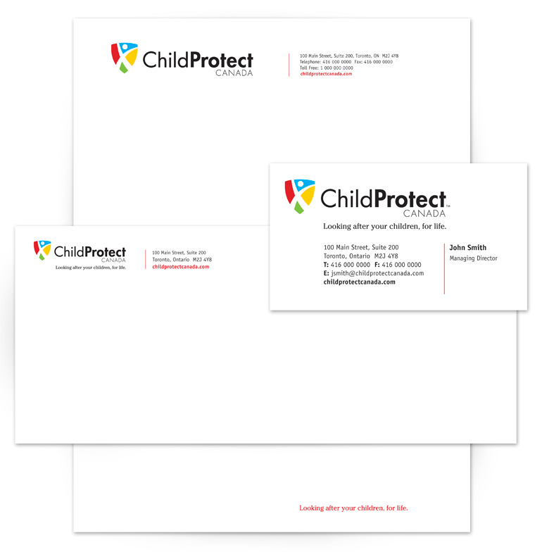
ChildProtect Canada provides a range of products and services that enable families to better cope when a child is diagnosed with and survives a serious illness or medical condition. The ChildProtect Canada logo had to appear strong, solid and reliable while reflecting the company’s focus on children. We therefore chose primary colours often associated with children and reinforced the protection aspect of the products and services by combining an image of a healthy, happy child with a shield symbol.
The word Protect was expressed in bold type, to create a strong relationship between that word and the shield. As a result, the logo’s meaning and company name resonate with the viewer instantly.

