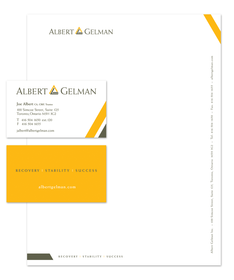
Albert Gelman specializes in solutions for businesses and individuals facing financial crises. To evoke the stability and professionalism of the company, Albert Gelman required a new logo that would visually communicate these attributes. We used the triangle, the strongest geometric shape, to convey stability and a strong foundation. Formed by the letters ‘A’ and ‘G’, the triangle also represents the two principles of the firm, Joe Albert and Bryan Gelman.