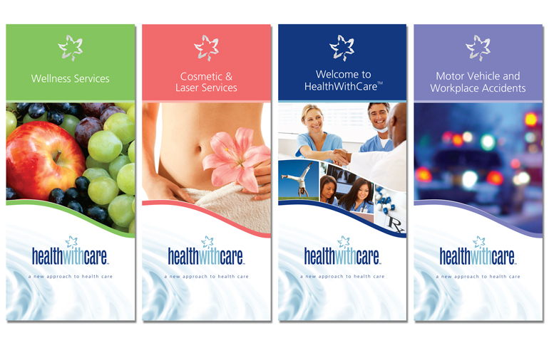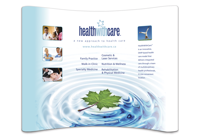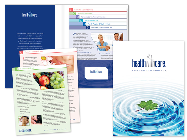
HealthWithCare is a modern health care clinic that provides consolidated health care services in accordance with the OHIP model.
We established the HealthWithCare brand using two powerful symbols: the maple leaf and clean water. While the maple leaf is unmistakably Canadian, pointing to HealthWithCare’s Canadian foundations, the clear water is unquestionably life affirming. The water’s rippling effect also suggests healing energy and outward reach. With these elements in place, we chose a series of images that not only conveyed HealthWithCare’s fresh approach to healthcare, but also the cultural diversity of their clients. All of these components were applied to HealthWithCare’s various communications materials for a positive impression on investors, medical professionals and potential patients.


