Waterloo Wellington Community Care Access Centre
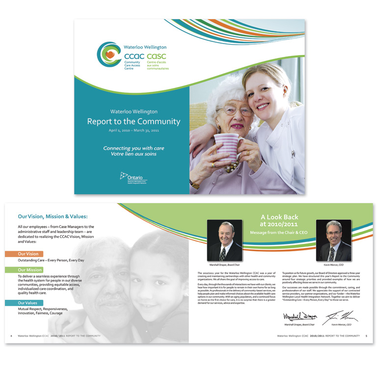
The Waterloo Wellington CCAC (WW-CCAC), like other CCACs (Community Care Access Centre) across Ontario, provides health care assistance to local community members. In support of their extensive programs and services, the WW-CCAC required communications materials that would make their location easily identifiable and stay consistent with the CCAC brand.
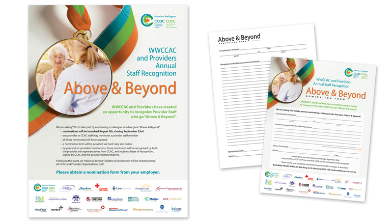
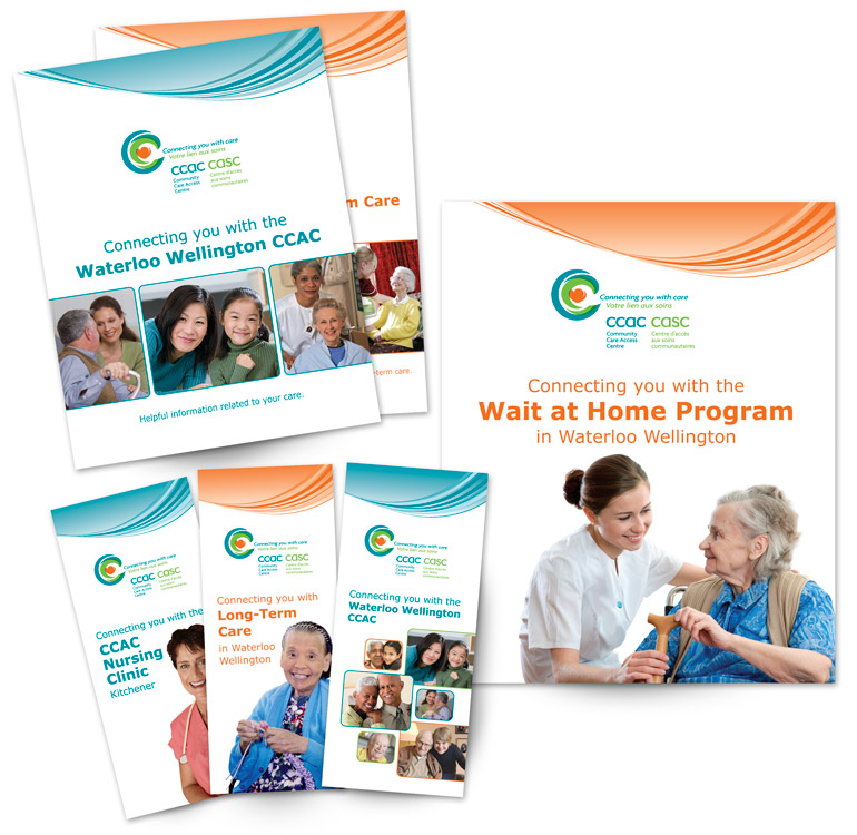
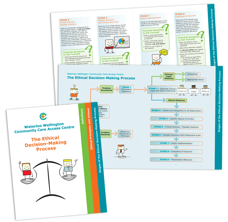
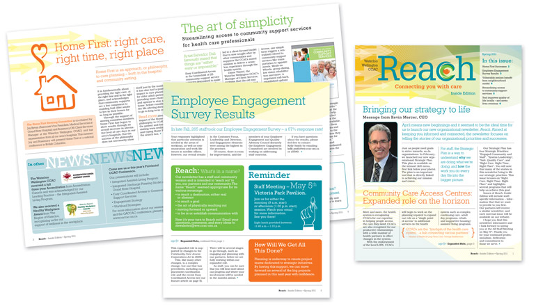
In the development of the WW-CCAC annual report and brochure series (a total of eight) we incorporated a stylized rounded wave applying either singular or multiple CCAC logo colours to the wave. For the poster and newsletter the wave appears in alternate forms. For example, on the poster the main CCAC logo colours make up the ribbon of the achievement medal, and on the newsletter a multi-tonal, overlapping series of waves constitute the masthead. Though the ethics booklet appears somewhat different, largely to differentiate its content, the colour scheme and fonts within the booklet maintain the WW-CCAC’s branding.