ChildProtect Canada provides a range of products and services that help families cope with their child’s serious illness or medical condition.
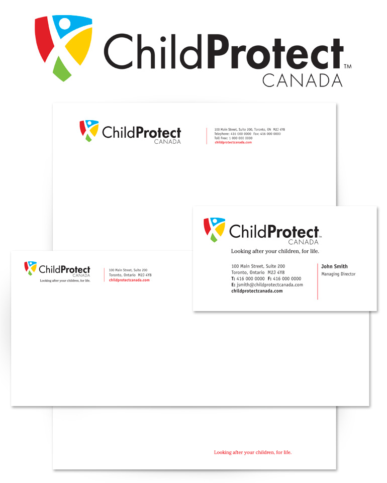
In establishing their visual identity, we recognized ChildProtect’s need to appear strong, empathetic and reliable. For the logo, we combined a stylized graphic of a healthy, happy child within a shield symbol to visually reinforce the company name. By applying primary colours to the shield and expressing the word Protect in bold type, we furthered this concept. Consequently, these visual cues immediately communicate ChildProtect’s overarching goal.
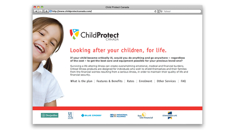
Building from the logo design, we created ChildProtect’s marketing materials with bright, bold primary colours, alongside images of smiling, happy children. In some cases we wrapped text around these images to underscore the child’s movement and call attention to the way children form the heart of ChildProtect. On each designed piece we made sure the information was compelling and easy to read.


