Corbrook is a non-profit organization geared towards developing and providing opportunities for persons with varying levels of ability.
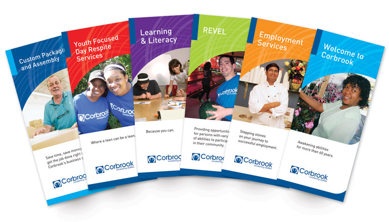
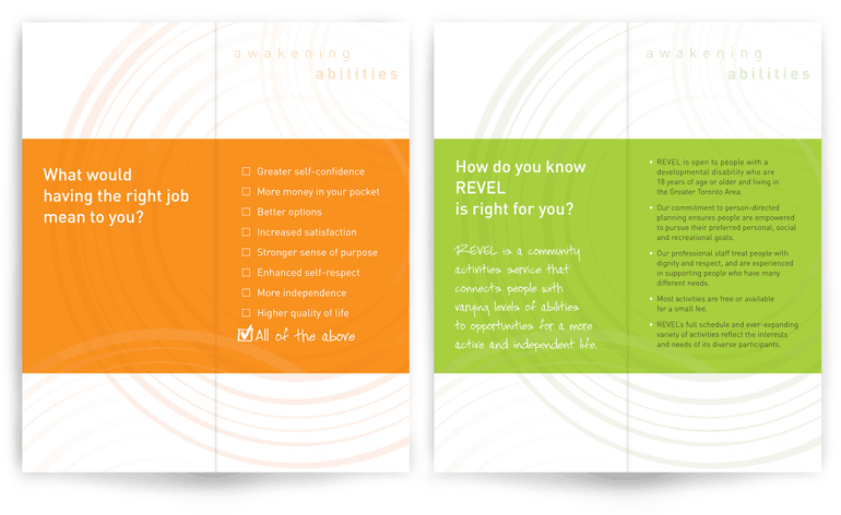
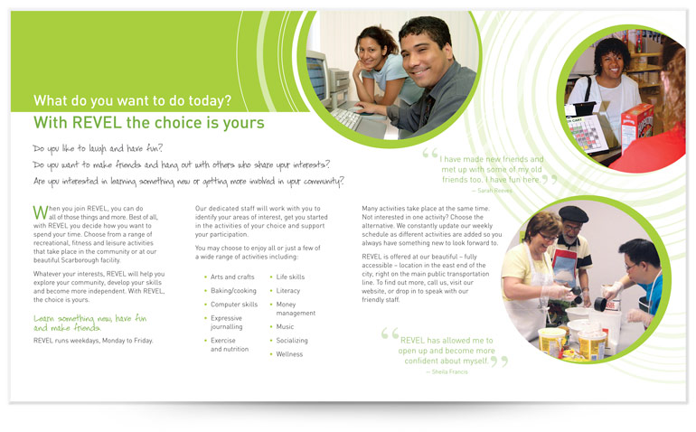
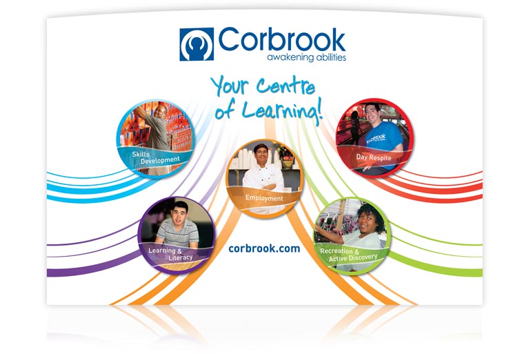
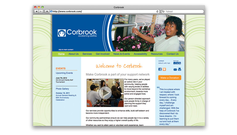
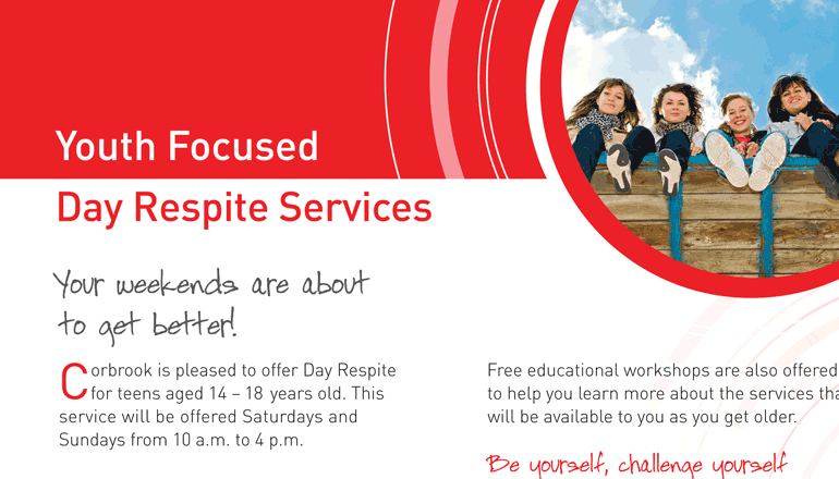
To convey Corbrook’s mission of Awakening Abilities, we developed the Corbrook visual identity using a circular, multi-layered graphic, which suggests growth and moving forward. We then used colour to define Corbrook’s service categories, and friendly photographs further distinguish each category. We also used the Corbrook blue to consistently reinforce the brand.
This theme was then applied to stationery, banners, printed brochures and the company website. On the website itself, Corbrook needed to include several accessibility features. Accordingly, we added functions for resizing text and adjusting colour contrasts, along with controls for persons using screen reader devices.
As a result, Corbrook’s collateral pieces reflect the meaningful work and personal development that Corbrook provides.
